Across multiple products, the same friction points kept appearing at the most critical touchpoints: signup, login, and account recovery. Vague error messages left users stuck. Password requirements stayed hidden until something broke. Recovery flows offered no reassurance.
The goal was to redesign these flows from scratch using three principles: clarity in error messaging, simplicity in flow structure, and upfront password guidance.
DataSentry.
Redesigning authentication flows for clarity, reducing user frustration at the most critical touchpoint in any product.
CASE STUDY — 2022
Auth flows that worked against users
Type
UX · UI · Illustration
client
Passion Project
role
UX + UI Designer
Date
2022
01 — Problem
Consistent Pain Points
Across Projects
"Every error message should tell you what went wrong and what to do next."
01
Unclear Error Messages
Users frequently encountered confusion due to vague error messages during signup and login. The lack of clarity left them frustrated with no direction on how to proceed.
02
Password-Related Frustrations
Password creation and management consistently caused friction. Requirements stayed hidden until submission, leading to repeated failures and account lockouts.
03
Account Recovery Challenges
Users attempting to recover their accounts hit convoluted processes with no reassurance at each step. The existing flows were not built with recovery in mind.
02 — APPROACH
Synthesizing Into
a Unified Approach
Clarity
Error messages should be informative and solution-oriented. No vague copy, no dead ends.
Simplicity
Flows should guide users step-by-step. One action at a time, no cognitive overload.
Password Guidance
Password creation should be made easy with visible requirements, real-time hints, and clear feedback.
03 — ILLUSTRATION
Technical but approachable
Deep blue and violet palette reinforces data security. Floating orbs and geometric forms create depth without feeling cold or clinical. Done in Figma.

04 — THE FOUR FLOWS
Designed and
Prototyped End to End
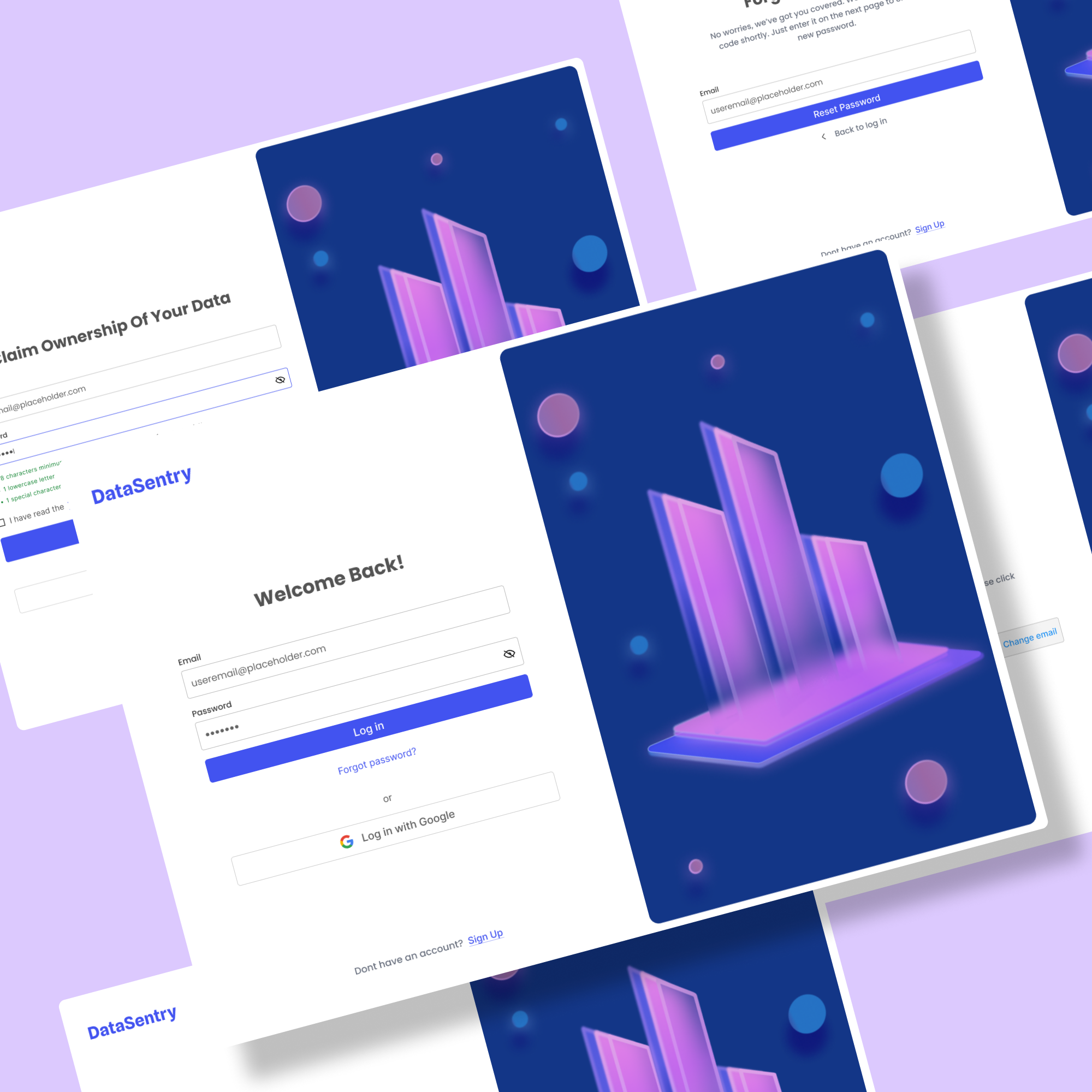
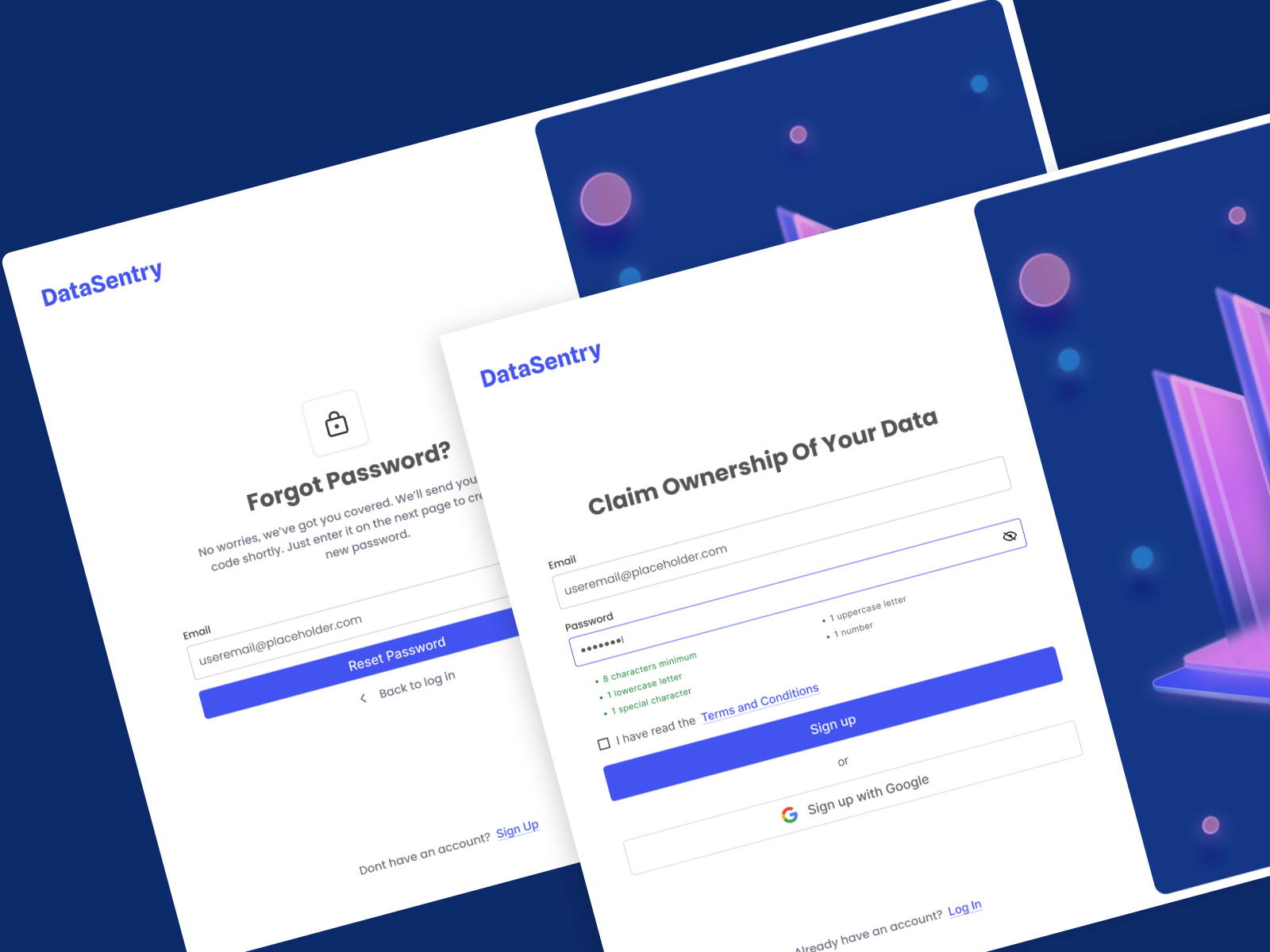
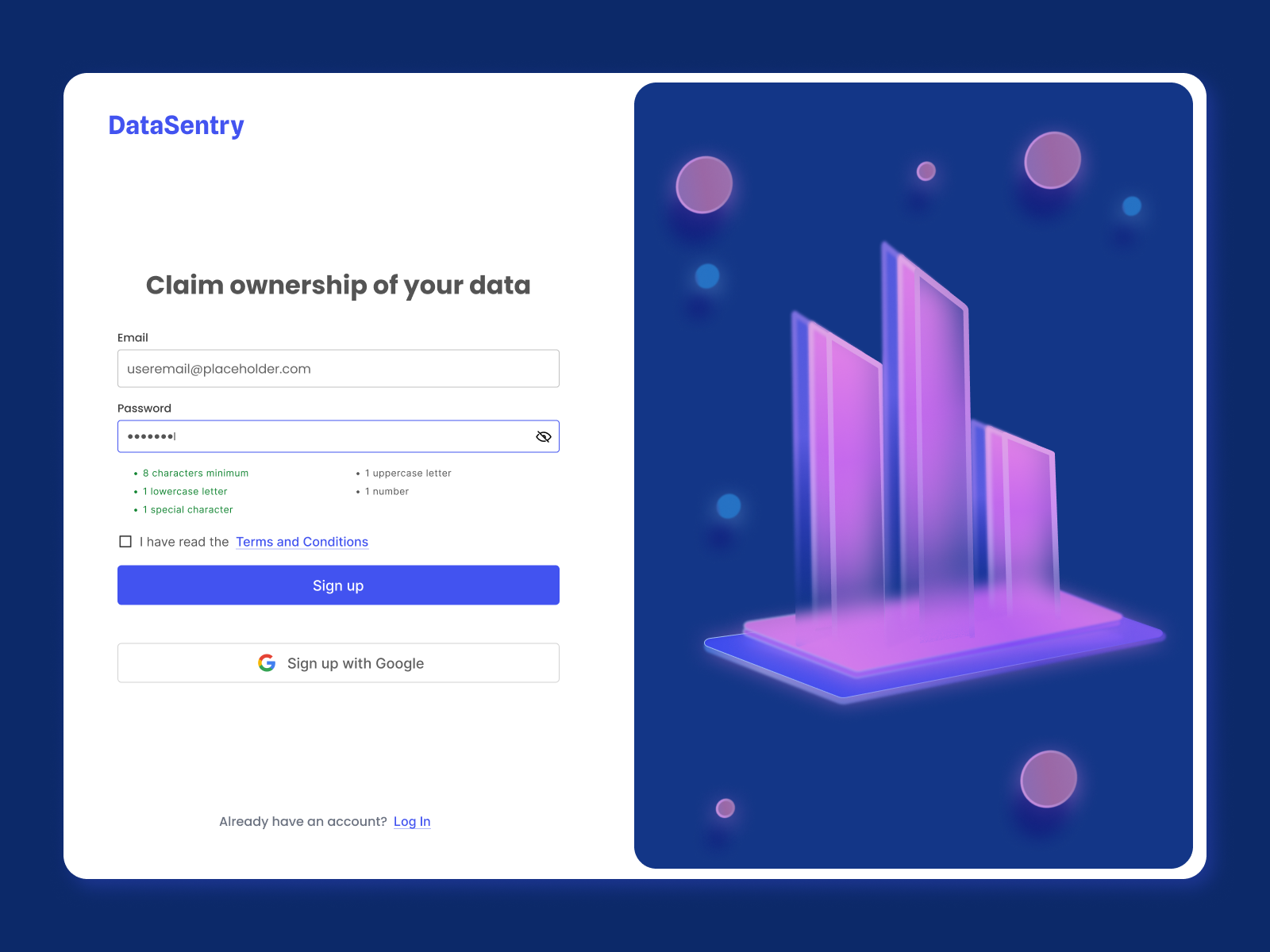
Sign Up
Password requirements shown upfront with real-time validation. Clear inline guidance at every field so users succeed on the first try.
"Oops! The passwords you entered don't seem to match. Show Passwords."
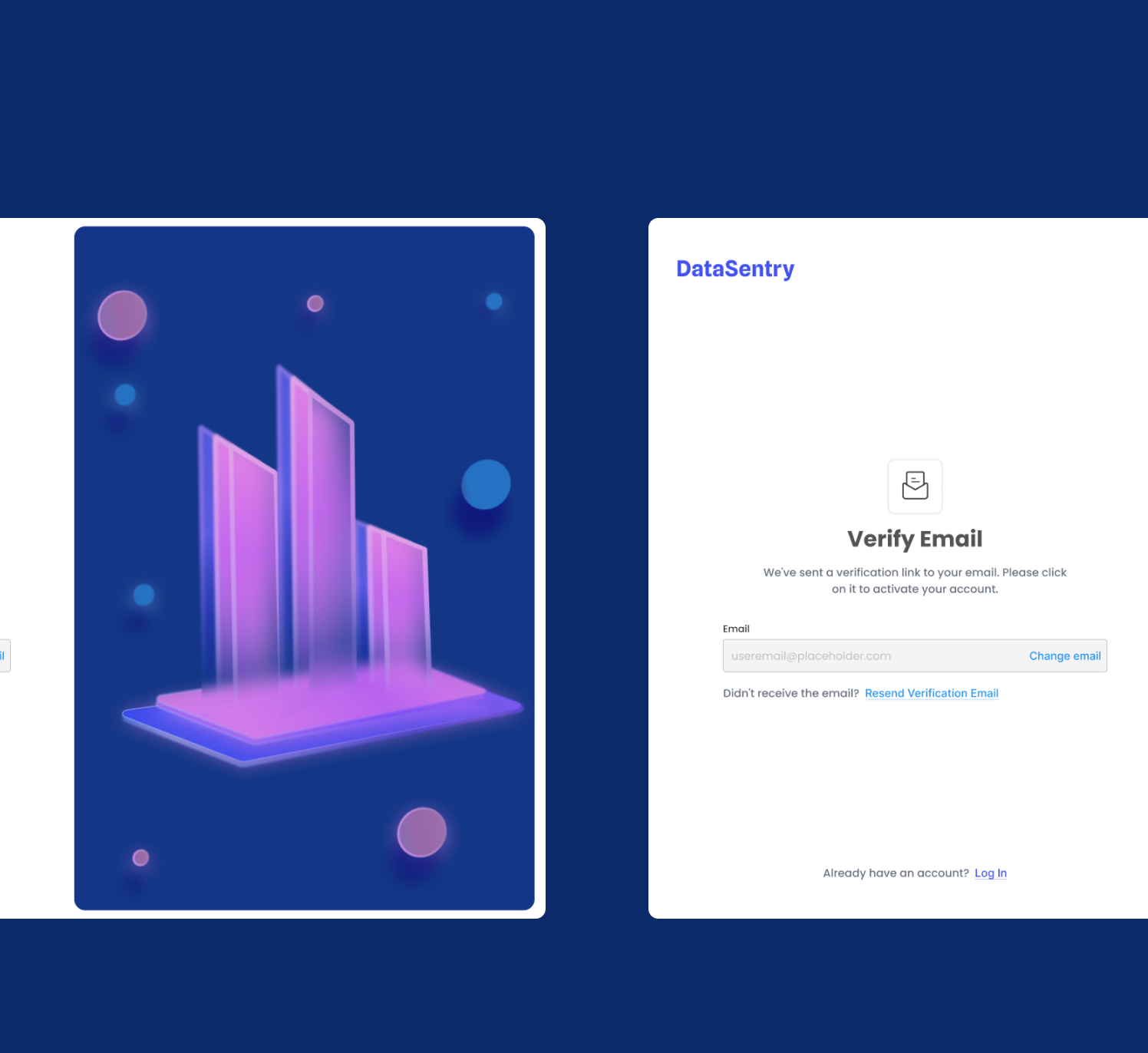
Verify Email
Clear step-by-step instructions guide users through verification with no ambiguity about what action to take next.
"We've sent a verification link to your email. Click it to activate your account."
Login
Friendly error states that remove blame and immediately offer a path to recovery. No dead ends.
"Password mismatch! It happens to the best of us. Let's help you reset it."
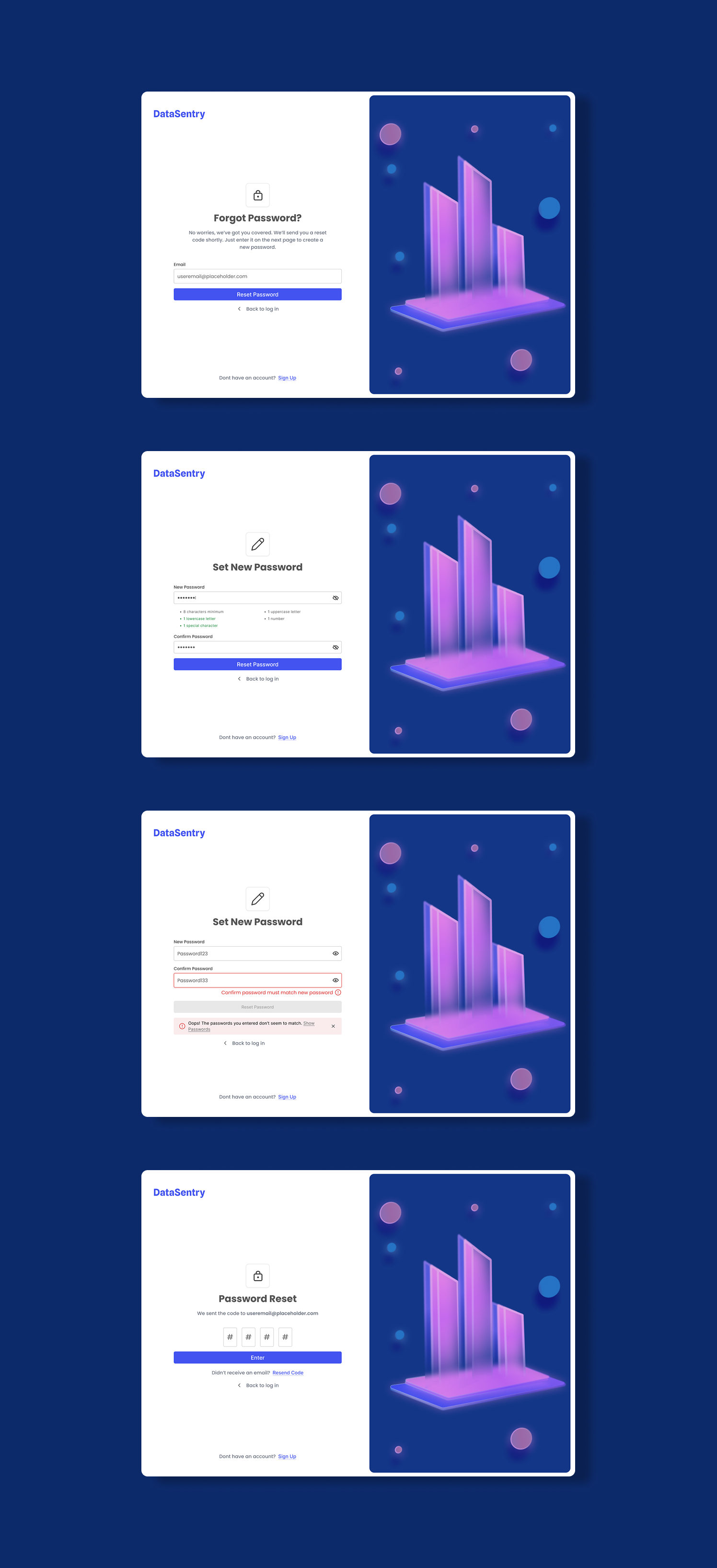
Forgot Password
Step-by-step recovery with reassuring microcopy at each stage. Users always know where they are and what comes next.
"No worries, we've got you covered. We'll send a reset code shortly."
05 — The Work
All Screens,
All States
06 — Delivery
What It
Delivered
4
Auth flows fully designed.
1
Custom illustration built for the brand
1
interactive Figma prototype built and documented