The brief was stripped down on purpose. Build a brand from a name and an industry, nothing else. I got Casual Friday and cannabis. The rest was mine to figure out.
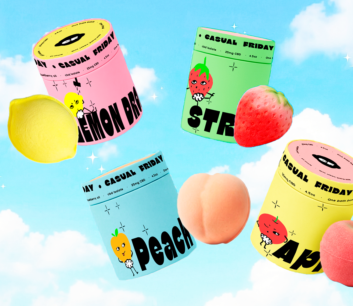
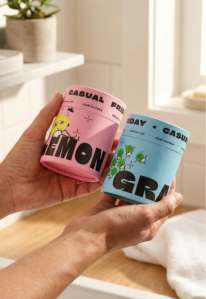
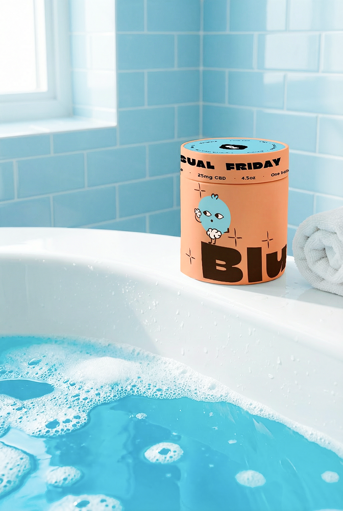
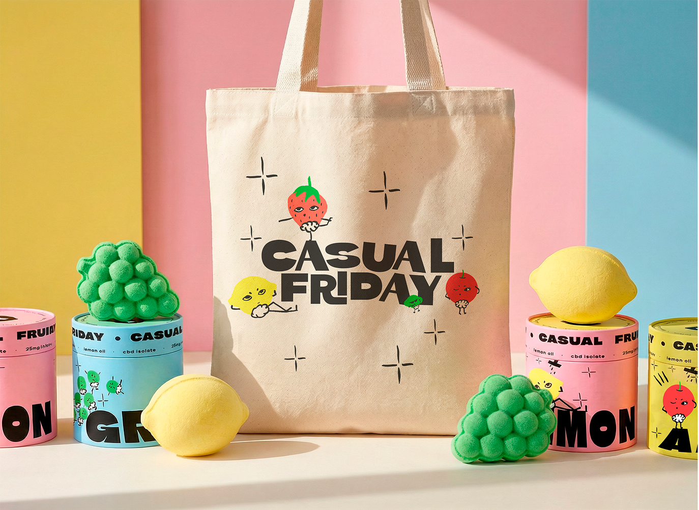
Most people would go dispensary. I went bathroom. CBD bath bombs felt like the right move. A product people actually want in their home, not just something they tolerate. From there the brand had one rule: keep it fun, keep it a little spicy, and never take itself too seriously.
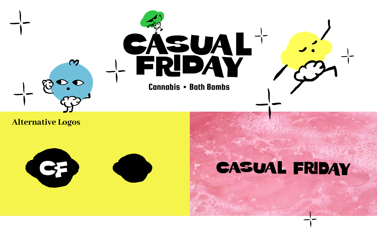
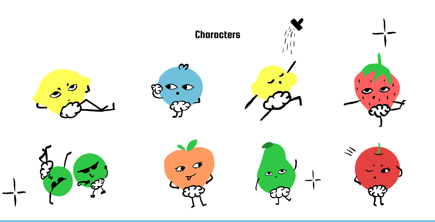
The character system came from wanting something minimal but memorable. Not a mascot. Not a logo character. Something in between. Flat, a little cheeky, and tied directly to the product line.
Casual Friday
Build a Cannabis Brand. Make It a Bath Bomb Company.
01 — THE CHALLENGE
A Name. A Category. That's It.
Type
Branding · Cannabis
client
School Project
role
Brand Designer
Date
2026
02 — CONCEPT & IDEATION
Bold.
Bathed.
Relaxed.
Cannabis brands pick a lane. Clinical or chaotic. Casual Friday needed a third one. The concept became a brand that feels like a good Friday. Effortless, unbothered, and something to look forward to
01 — Direction
Not a Dispensary. Not a Spa.
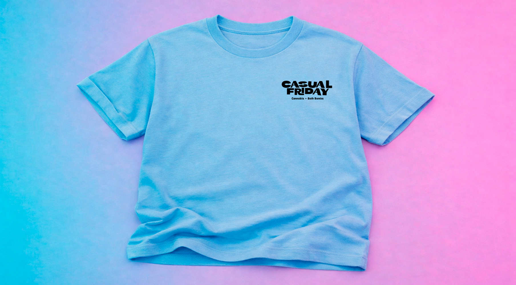
Most cannabis bath brands play it safe. Casual Friday commits to a third lane entirely. Bold illustrated packaging, a strong character system, and copy that never takes itself too seriously.
02 — Visual Language
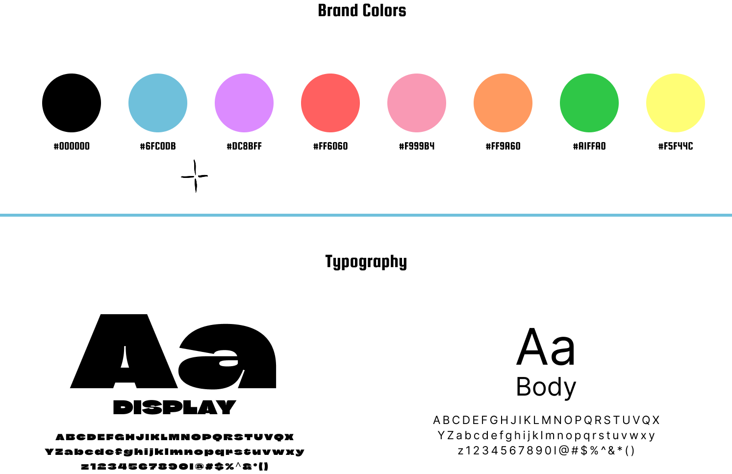
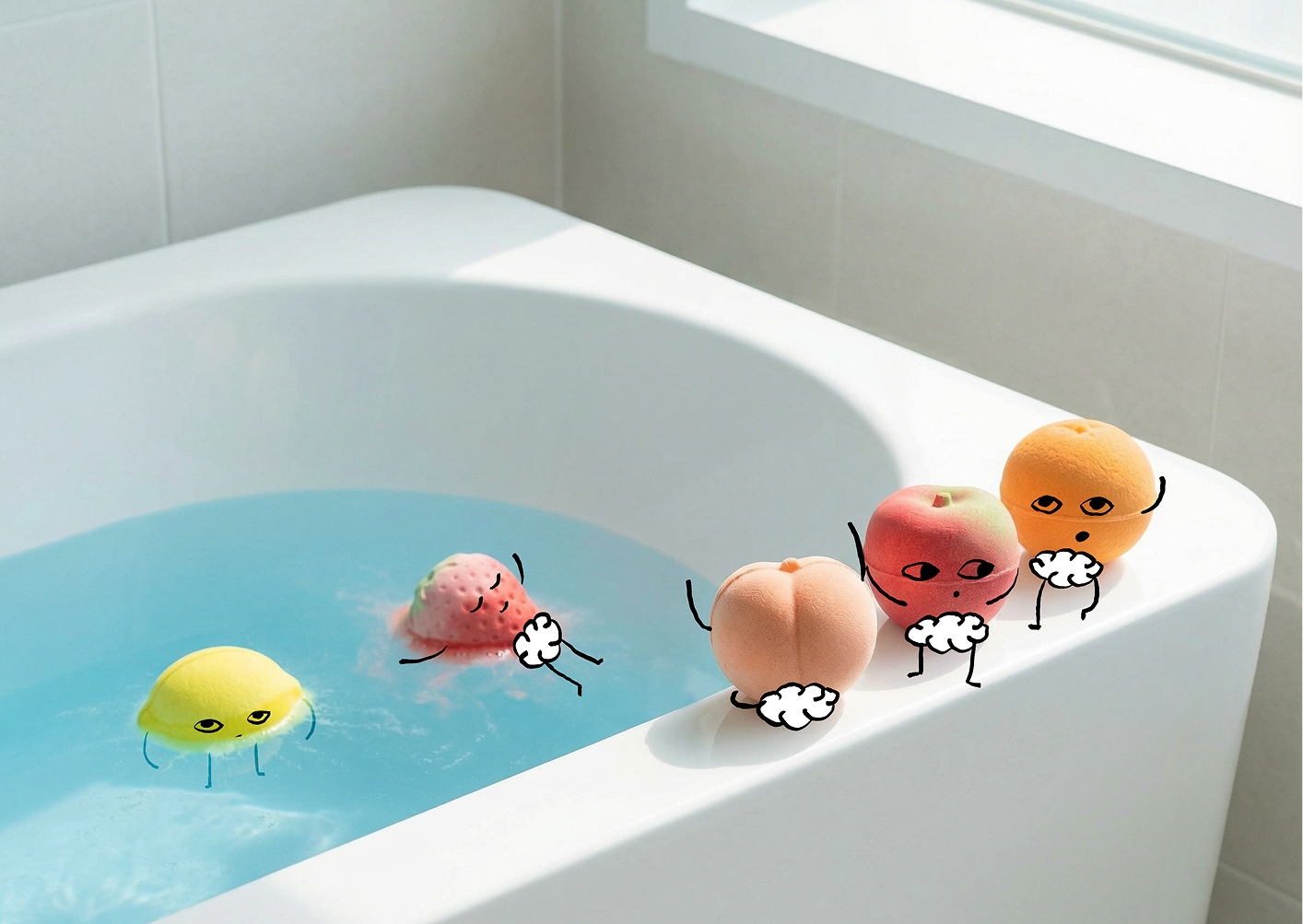
Flat Characters. Big Energy.
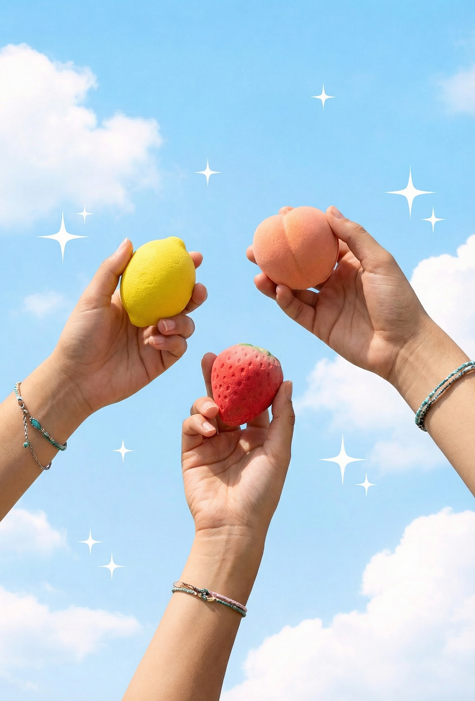
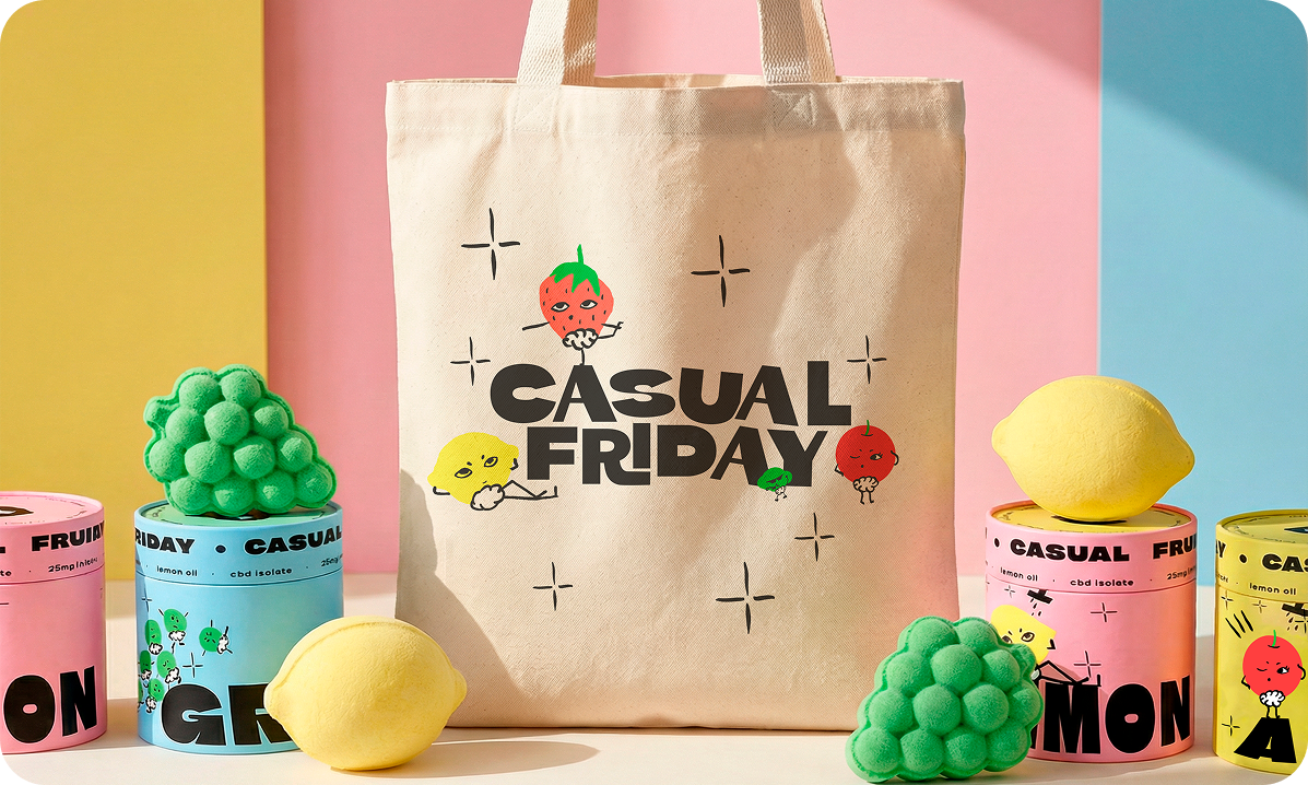
Cut-paper illustration meets gestural figure drawing. The character system gives the brand a face without being cartoonish. Seven fruit mascots, each tied to a SKU and a mood.
03 — Naming & Voice
Short. Punchy. No Fluff.
Every product name is two words. Every tagline is one line. Direct without being cold, playful without the stoner clichés. "Zest in peace." "Drop in. Zone out."
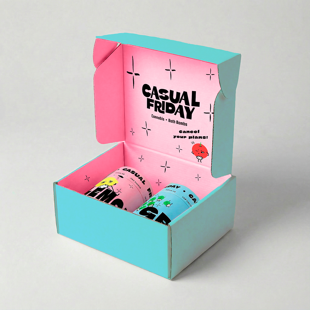
03 — PACKAGING MOCKUPS
Mockups made with ai