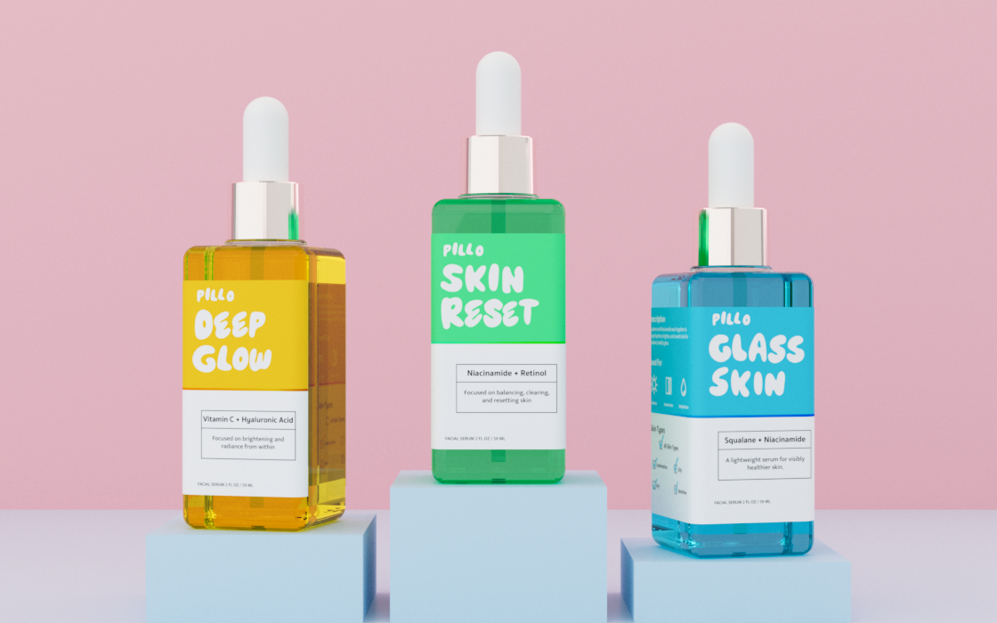
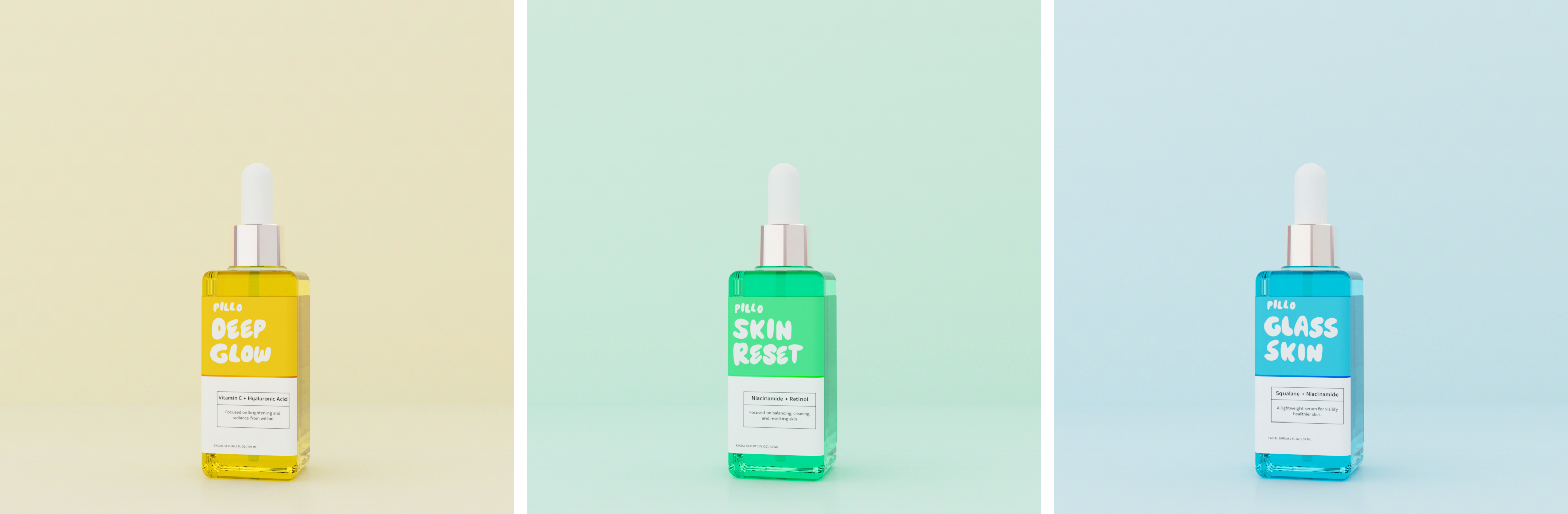
I wanted a serum you'd actually reach for. Most self-care feels like either a chore or a flex, so this one goes the other way: playful, always moving, and easy to enjoy. Three bottles, and one look tells you what each one does.
Pillo
Type
Brand Identity · Packaging · Web
client
Concept Project
role
Brand Designer
Date
2026



Pillo
Discovery
A school brief for a serum brand, three formulas under one system. I skipped the usual clinical minimalism and built something that feels like a good mood, playful, colorful, and easy to actually enjoy using.
What it stands for
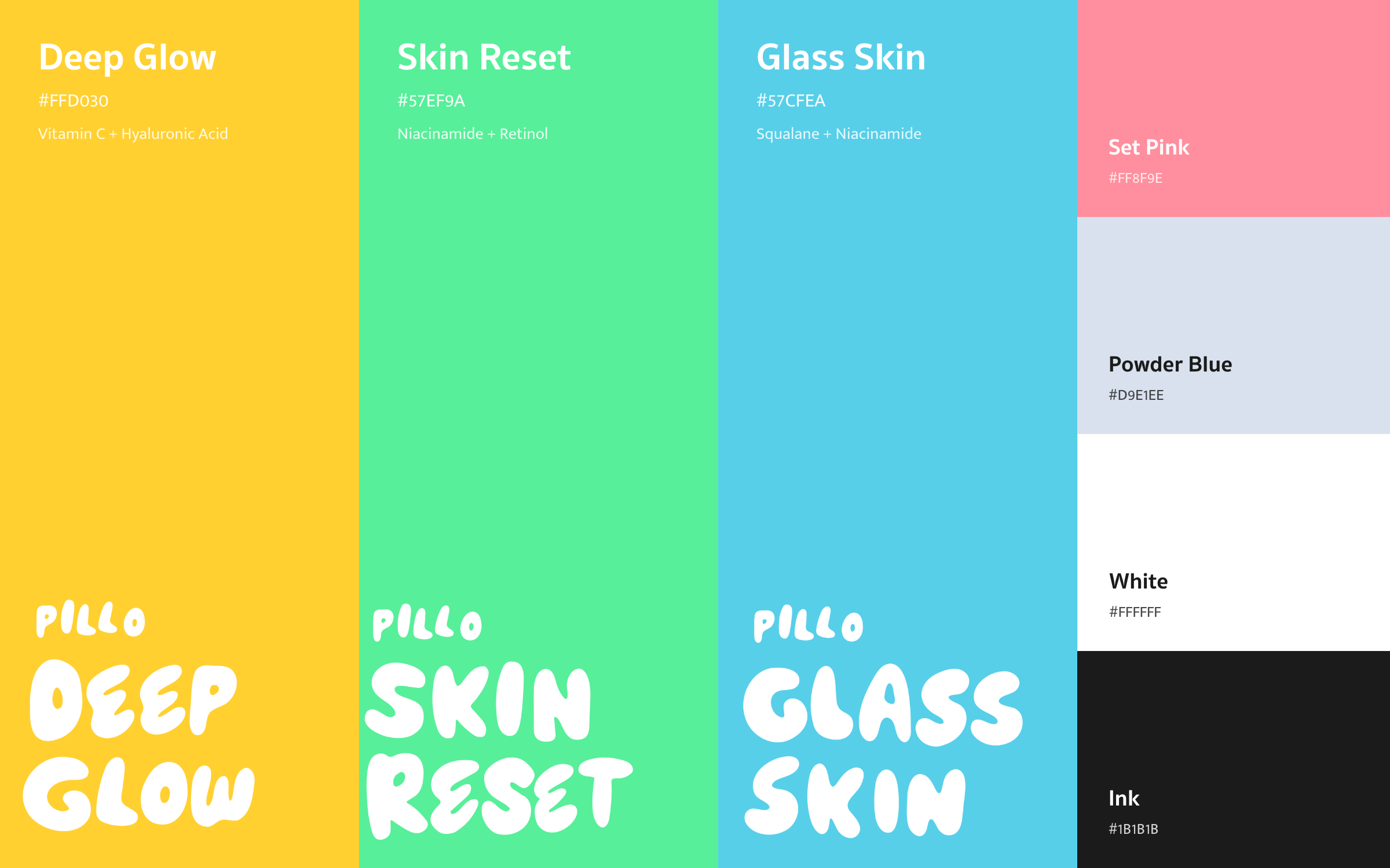
Fun, fresh, and glowing. Self-care that never feels like a chore or a flex. Each serum owns its own shade, so you know what it does before you read a single word.
How it looks
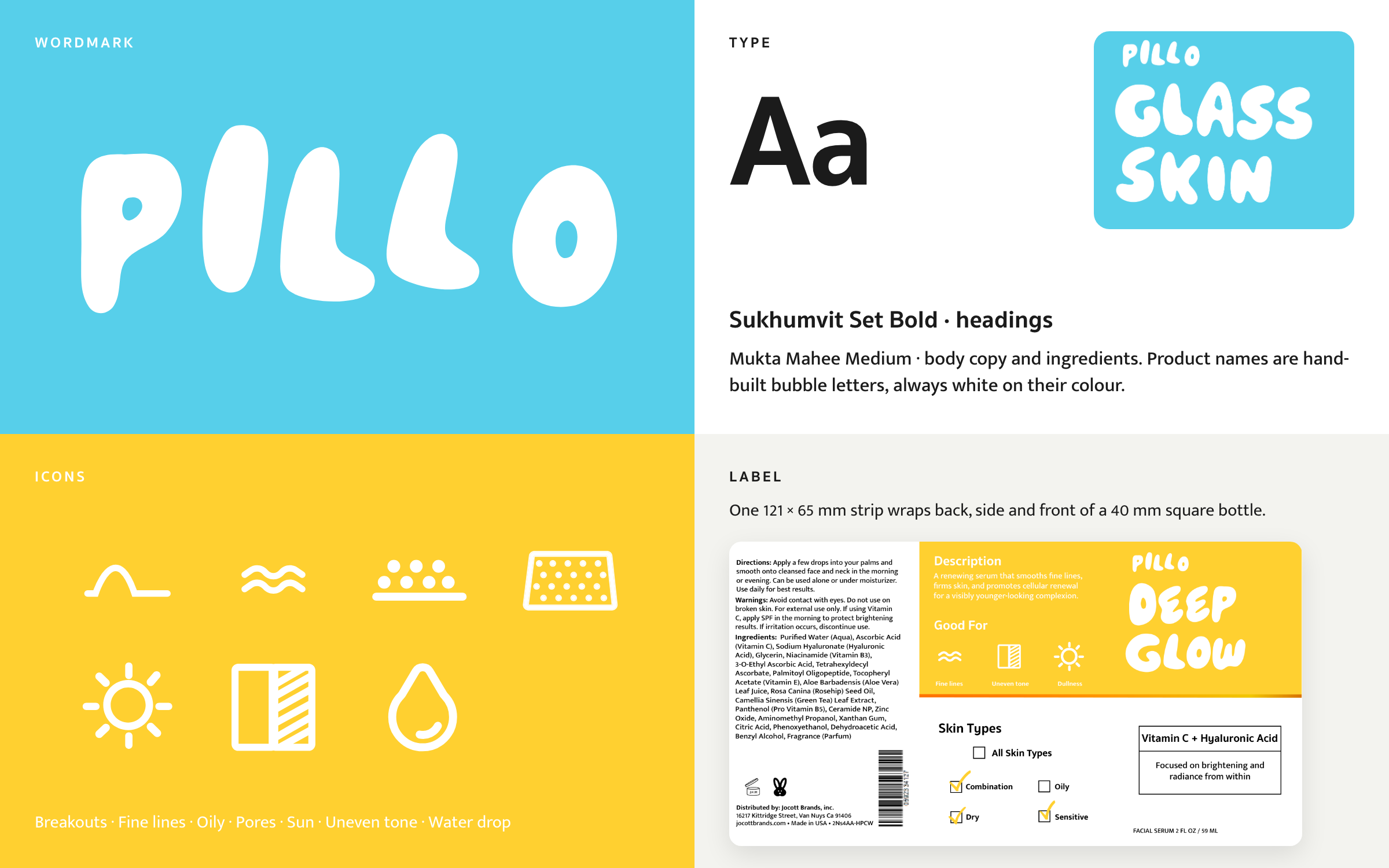
Three colour-coded serums under the PILLO wordmark, set from the same bubble letterforms as the names. One three-panel wrap label, a quiet information system, and a pastel set that keeps the line light.
Out in the world
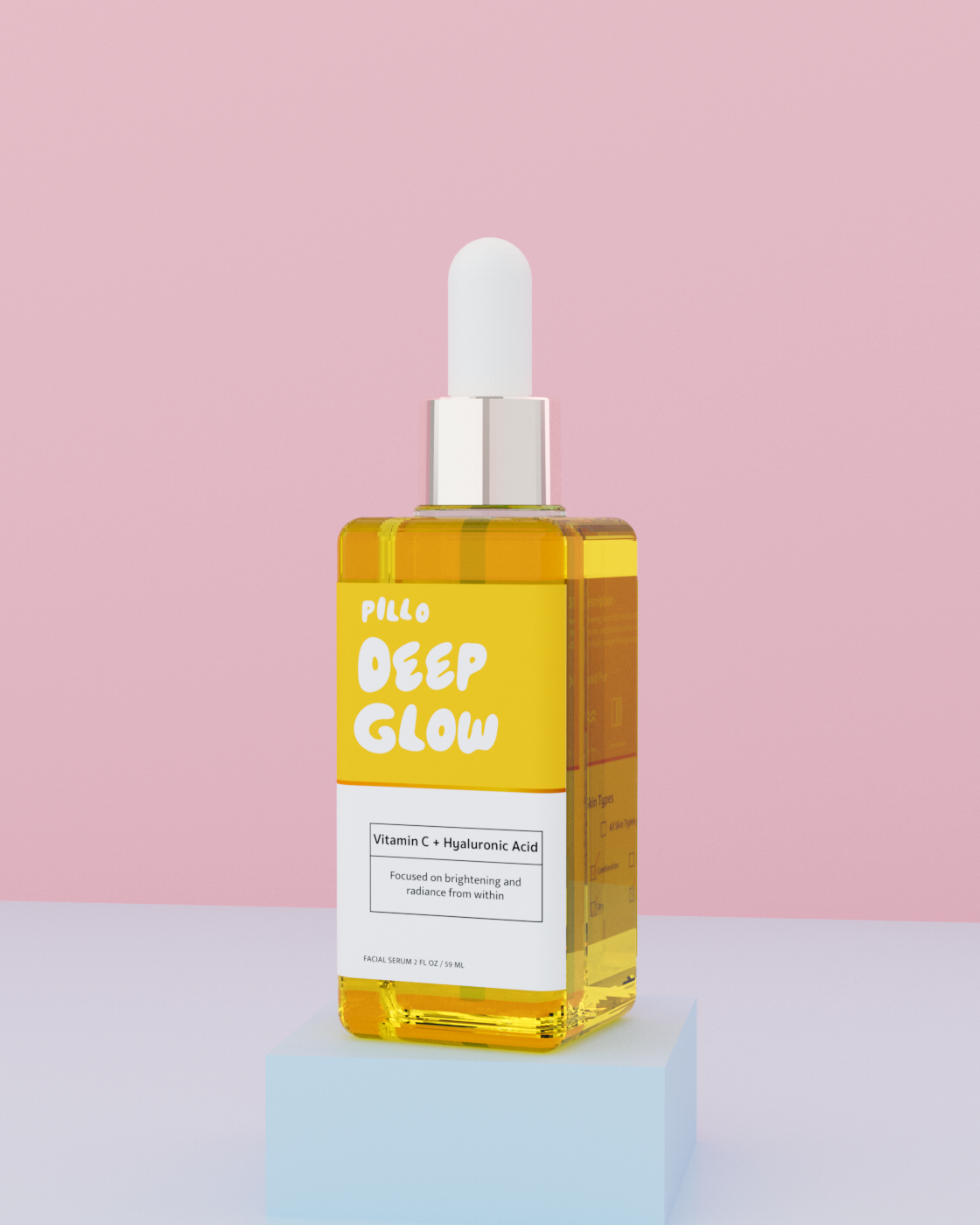
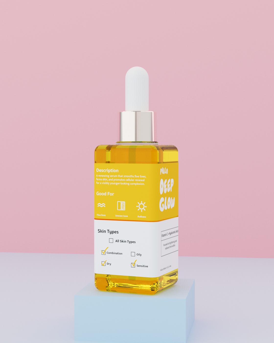
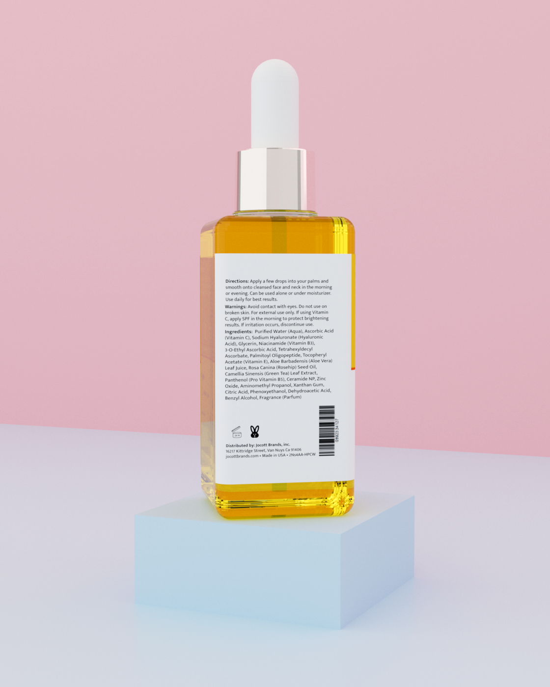
Real 3D packaging, not stock mockups. A lineup, heroes, back-of-pack and square launch tiles, all from one scene so every piece reads as one brand.