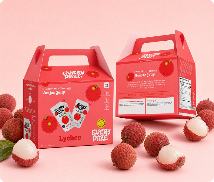
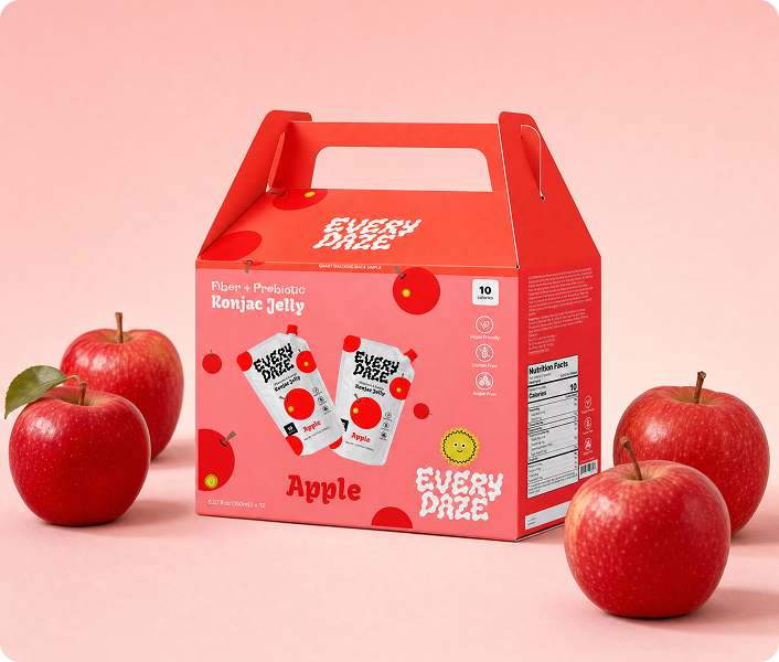
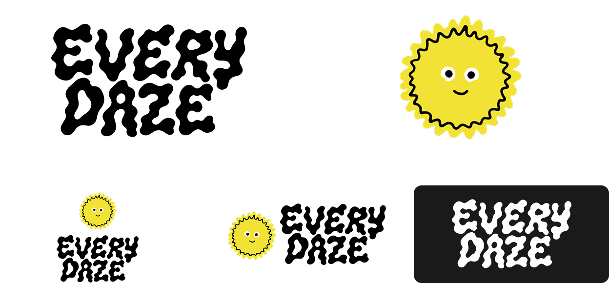
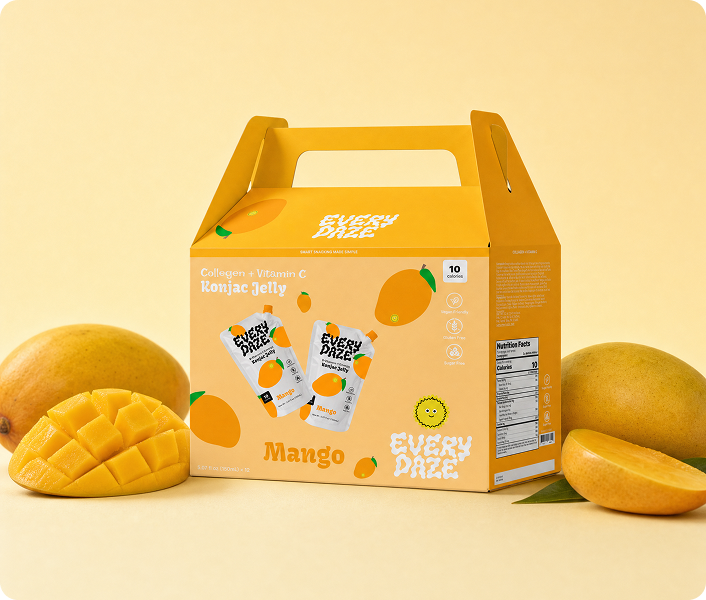
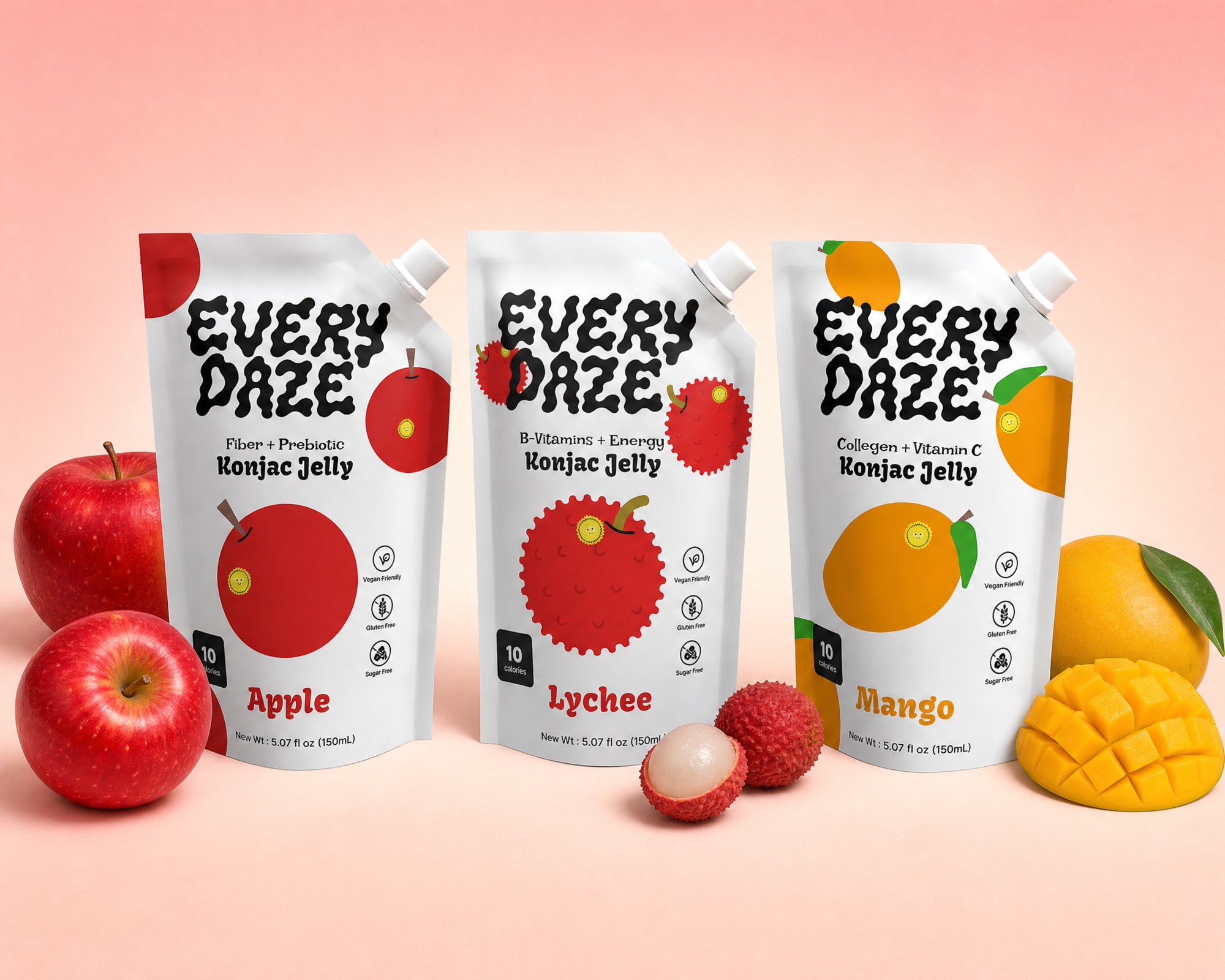
EveryDaze makes konjac jelly pouches that are actually good for you. The old packaging used soft gradients and nothing that made you want to pick it up. I redesigned the whole brand to feel bold and craveable, something that looks as good as it is.
Everydaze
Type
Branding · Web Design
client
School Project
role
Brand Designer
Date
2026
01 — The Challenge
No identity. No reason to reach for it.
EveryDaze targets young women who care about wellness but don't want their snacks to feel like medicine. The original packaging was all soft gradients and no personality. There was no real brand identity behind it, nothing cohesive, nothing that felt intentional. It blended in when it needed to stand out. The job was to build a brand from scratch.

02 — The Impact
People actually wanted to pick it up.
The research made the direction clear. Health snacks tend to lean on clinical packaging, lots of white space and ingredient callouts, without much personality. EveryDaze had a better story to tell, and the new brand gave it room to tell it.
When people saw the redesign, the feedback was consistent. It felt more approachable and less clinical than anything else in the category. Not like a supplement you tolerate, but something you actually want. A few people said it finally felt fun, which is exactly what konjac jelly should feel like.